Consistency might not sound like the most exciting word, but trust me, it’s the secret ingredient that transforms a good brand into an unforgettable one. Think of it like your favorite coffee shop – you keep going back because the coffee always tastes amazing, the baristas are friendly, and the atmosphere is just right. That consistency is what keeps you coming back for more.
Your B2B brand needs that same consistent magic, especially on your website. From the colors you choose to the way you talk to your customers, every little detail should feel like it belongs together. It’s like having a well-rehearsed band where everyone knows their part and plays it perfectly.

Why Does Consistency Matter So Much?
Imagine you’re checking out a website, and one page is all bright and modern while the next looks like it’s from the 90s. That’s confusing, right? One page is decked out in blue, the next in green, and the fonts are all over the place. Not to mention, the low-quality images scattered throughout. It’s like a chaotic garage sale!
You wouldn’t trust a company that can’t even get its own branding straight.
That’s where consistent brand messaging comes in. It’s your secret weapon for building trust, credibility, and a loyal following. When your messaging is on target, customers know what to expect from you, and that’s a powerful thing.
In this guide, we’ll walk you through the ins and outs of consistent brand messaging in B2B web design. Get ready to discover how to design a successful website that not only looks sharp but also builds trust, credibility, and lasting relationships with your customers.
What’s in it for you?
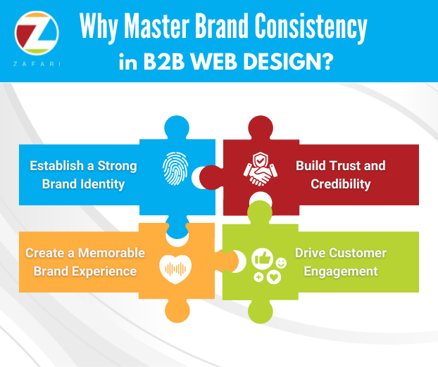
By mastering consistent brand messaging, you’ll unlock a whole bunch of benefits:
- Establish a strong brand identity: Your website will become a visual representation of your brand’s personality, values, and expertise.
- Build trust and credibility: When your messaging is consistent, customers know what to expect from you, and that builds confidence in your brand.
- Create a memorable brand experience: Your website will leave a lasting impression on visitors, making them more likely to remember you and come back for more.
- Drive customer engagement: Consistent messaging helps you connect with your audience on a deeper level, fostering loyalty and advocacy.
Ready to dive in and create a website that truly reflects your brand? Let’s get started!
- Visual Harmony: Your website should look like a unified whole, not a bunch of random pages thrown together. That means choosing a color palette that reflects your brand’s personality and sticking with it throughout your site. Same goes for fonts – pick a few that are easy to read and complement your overall design.
- Color Scheme: Stick to your brand’s colors across all pages
- Typography: Use the same fonts for headers, body text, and buttons
- Imagery: Choose images that reflect your brand’s values and style
- Voice and Tone: How does your brand “talk”? Are you serious and professional, or friendly and approachable? Once you’ve defined your brand voice, make sure it shines through in all your website copy, from product descriptions to blog posts.
- Consistency: Use a consistent tone, whether it’s formal, friendly, or technical
- Clarity: Make sure your message is clear above all else
- Messaging Across Channels: Your website isn’t the only place where your brand lives. Your social media, email marketing, even your business cards should all convey the same consistent message. This creates a seamless experience for your customers, no matter where they interact with your brand. Keep your core messages uniform across all content:
- Website
- social media
- email signature and campaigns
- sales decks
- print assets
- on hold messages
- customer communications
- Customer Experience: Your brand isn’t just about how you look – it’s about how you make people feel. Make sure your website is easy to navigate, your customer service is top-notch, and your overall experience leaves a positive impression.
Nailing Your Brand’s Vibe: 3 Ways to Keep Your Website on Target
Your brand is your company’s personality. It’s the unique blend of voice, style, and values that set you apart. Just like you want to show up as your best self in person, your website needs to consistently reflect that awesome brand personality.
But how do you make sure every corner of your website is singing the same tune? It’s easier than you think! Here are 3 tips to keep your online presence on-brand:
- Create a Brand Style Guide: Think of this as your brand’s fashion playbook. It outlines everything from your logo and color palette to your preferred fonts and tone of voice. This guide is your go-to resource for keeping things consistent. (Psst…our StoryBrand framework can help you nail your brand’s messaging!)
- Regular Check-Ups: Websites aren’t static – they evolve as you add new content and features. That’s why it’s important to give your site a regular once-over to make sure everything is still aligned with your brand guidelines. Think of it like a quick mirror check before heading out the door.
- Get Your Team On Board: Make sure everyone involved in creating content or updating your website is on the same page when it comes to your brand. You can even bring in an industrial marketing specialist to give your team a crash course in branding best practices.
By following these simple steps, you’ll create a web design that’s not only visually appealing but also a true reflection of your brand. And when your brand is rock-solid, you’ll build trust with your audience, boost engagement, and drive more conversions.
[P.S. Don’t have the bandwidth or expertise to do it in-house? We got you! Check out our B2B website design services.]
Keeping Your Brand Vibe Cohesive (Even When Things Get Crazy)
Alright, consistency is awesome for building a killer brand, but let’s be real – it’s not always a walk in the park. In the B2B world, things can get tricky fast, especially when multiple people are contributing to your website and marketing materials. But don’t worry, we’ve got your back!
Challenge #1: Too Many Cooks in the Kitchen (a.k.a. Multiple Contributors)
When you’ve got different departments or team members chiming in on your website, things can get messy. Different voices, different styles, and suddenly your brand message is all over the place. It’s like a band trying to play different songs at the same time – not a good look.
The Fix:Get everyone on the same page (literally!). Create a
clear brand style guide that outlines your brand’s voice, tone, visual elements, and messaging guidelines. This
way, everyone’s singing from the same songbook, and your brand stays harmonious. A content management system
(CMS) with built-in approval workflows can also help keep everyone in check.
Challenge #2: Keeping Up with the Joneses (a.k.a. Trends)
Web design and marketing trends change faster than you can say “algorithm update.” What’s hot today might be yesterday’s news tomorrow. If you’re not paying attention, your website can quickly look outdated and lose its edge.
The Fix: Don’t be afraid to give your brand a refresh every now and then. Stay up-to-date on the latest trends, but remember to keep your core brand elements intact. It’s all about finding that sweet spot between staying current and staying true to yourself.
Challenge #3: Brand Makeover (a.k.a. Evolving Brand)
Sometimes, your brand needs a complete makeover. Maybe you’re launching a new product line, rebranding your company, or pivoting your target audience. Whatever the reason, a brand evolution means your website needs to evolve too.
The Fix: When it’s time for a rebrand, go all in. Plan a comprehensive update of your website’s design, content, and messaging. Make sure everything aligns with your new brand direction, so your website is the perfect reflection of your shiny new image.
By tackling these challenges head-on, you’ll be well on your way to building a strong, consistent brand that resonates with your audience and drives real results for your business.
WooHoo! You’ve Rocked Your Brand Messaging…But Is It Working?
You’ve put in the work to create a consistent and on-brand website – awesome! But how do you know if your efforts are actually paying off? Don’t worry, it’s not rocket science. Here are three easy ways to measure the impact:
- Check the Numbers: Check out your website analytics. Are visitors sticking around longer? Are bounce rates dropping? Are you seeing more conversions? These are all good signs that your message is resonating with your audience and compelling them to take action.
- Listen to Your Customers: What are people saying about your website? Are they commenting on how easy it is to use? Positive feedback about your brand’s clarity and consistency is a clear indicator that you’re on the right track.
- Survey Time! Send out a quick survey to your audience to see how well they recognize your brand. Ask them questions like, “What three words would you use to describe our company?” or “How likely are you to recommend us to a friend?” Higher scores mean your consistent messaging is making a lasting impression.
By keeping tabs on these key metrics, you can make sure your brand messaging is not only consistent but also effective in driving results for your business.
Ready to Transform Your B2B Website?
Your website is often the first point of contact between your prospective customers and your business. Mastering consistent brand messaging takes time and effort, but the payoff is huge. By creating a cohesive and memorable brand experience, you’ll attract more customers, build stronger relationships, and ultimately grow your business.
If you’re ready to take your B2B website to the next level, I’m here to help. Let’s chat about how we can create a website that truly reflects your brand and delivers results.


