Your website is a critical aspect of your marketing presence. But is it effectively communicating your message and driving sales?
Here is a simple exercise to help you improve the efficiency of your website.
We call it the Grunt Test, a tongue-in-cheek way of saying that even a caveman should be able to understand it.

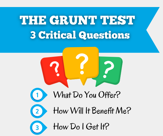
The Grunt Test – A Three-Question Litmus Test
Here’s a simple way to check if your website is doing its job:
Ask someone who doesn’t know much about your business to take a quick look at your website’s hero section for 5 seconds. Then, close the website.
Now, ask them three important questions.
- WHAT DO I DO?
- HOW CAN MY COMPANY BENEFIT YOU?
- HOW CAN YOU GET MY PRODUCT/SERVICE?

The point is here to judge their immediate understanding and perception of your website’s purpose and offerings by giving it only as much time as the average internet visitor will.
If they struggle to answer these questions easily, this is a clear indication that you’re losing potential sales opportunities.
The Importance of Clarity
At the heart of this exercise lies the concept of clarity.
Make sure your website delivers a clear, concise message that resonates with visitors from the moment they land on your page. Confusion turns prospects off. If they have to work to understand what you offer and how it can benefit them, they’ll get frustrated and move on to your competitor. This leads to missed opportunities and lost revenue.
This concern is particularly true for a manufacturer’s website. Many websites in the industrial sector are saturated with confusing or misleading images and overwhelming content.
The message may be too technical to understand while the images are not helpful. This is one of the common mistakes most manufacturer marketers make.
How to Pass the Grunt Test
If your website doesn’t pass this important litmus test, it’s time to make some improvements.
Question 1: What does our company offer?
This question is the core of your website’s purpose. If your website fails to clearly tell visitors what your business is all about, then you will lose sales.
Visitors should be able to identify your business’s primary function within seconds of landing on your homepage.
Therefore, make sure your homepage tells what you offer in a clear and concise way.
Avoid clutter and distractions. Keep it clean and straightforward, like a well-lit path leading customers to exactly what they need.
Question 2: HOW CAN MY COMPANY BENEFIT YOU?
But it’s simply not enough for people to understand your offer. They should also know how your products and services can specifically benefit them. Otherwise, they can just buy from your competitors.
Think of it like this: if someone looks at your website and doesn’t understand how your products or services can benefit them, then something’s is confusing them.
Your website should clearly and concisely highlight the benefits aggressively telling them how a certain product or service can solve their problems and improve their day-to-day experience.
Let’s say you offer computer-controlled film-cutting machines.
Perhaps the first few sentences of your website’s hero section might say:
“Precision Digital Film-Cutting Machine from Your Mobile Phone.”
With such a statement, your potential customers will immediately see the benefit: they can control a cutting machine right from their mobile device, leading to a smooth and convenient experience.
Question 3: HOW DO I GET YOUR PRODUCT/SERVICE?
Once visitors understand what your company does and how it benefits them, the next step should be crystal clear: how to take action.
Whether it’s making a purchase, signing up for a service, or contacting your team, the path to conversion should be intuitive and accessible.
If your potential customer struggles to identify how to get your product or service, it’s a sign that your website’s navigation and calls to action may need refinement.
One of the simplest things is to place your CTA for buying or signing can be placed on the top right corner of the banner of your home page in a bright color that can’t be missed.
Clarity is the Key
Helping your customers understand your business and its benefits comes down to creating a clear and complete message. Make sure to have everything organized across your website.
Tips for Success
- Cut through the clutter and focus on communicating your core message.
- Clearly articulate the benefits of choosing your products or services.
- Make sure that visitors can easily navigate your website and find the information easily.
- Use clear calls to action so that visitors can take the desired action.
- Use pointers, headings, and visual cues for a quick understanding at a glance.
OVER TO YOU…
If your website lacks clarity, you are likely to lose sales. That isn’t rocket science! So it’s very important that your website effectively communicate your message and value proposition to boost sales and promote customer engagement.
By optimizing your website based on the results of the Grunt Test [simple 3-question litmus test], you can make significant improvements that can increase your odds of getting positive results.
Best of luck!


